My New Logo | 我的新标志
I have been always wanting a Logo for myself and my tiny studio. What I lacked was a good idea. Several days ago, I came across a good template, The Rune alphabets. They were used by ancient Norse people who lived in what is called northern Europe today. The North Myth was written in this kind of language. The Norse people believed their written language have magic powers, so they curved these rune characters in their everyday items, including spears, ships, even bowls. And this kind of things are still available in the Viking Museum.
The alphabets are shown in this table, hover your mouse on the pics and you will know how they pronounce in German.
Back to my logo, as shown below, my logo which looks like a Rune alphabet is actually a transformation of the Chinese character of my Family name -LEE(李). In a certain kind of traditional calligraphy called Cao Shu(草书),it is written like the second pic. So I changed it in to curve-straight line pattern, which turned out to be rather ugly whatsoever. So here I transformed it more into a Rune alphabet. And its basic shape is a hexagon, which is pretty good for logo or even a badge.
Why it is orange-white? Simple, ’cause i love orange, i like orange the color, the fruit, and the juice. I am a big orange-fan.
Plus, orange is a very safe color, because sharks hate it. So when you walk on street wearing something orange, you will never be attacked by a shark, or an alien from Planet Shark. You got it?
However, i find this logo too formal, maybe i will come out with a more cartoon style version some time later.
![]()
PS:
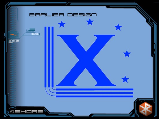
Here i present the logo i designed for myself when i was in junior middle school, it is just LX which is the initials of my name written in hanyu-pinyin. It was pretty cool when i was just a kid. But now it just looks so cheesy.


还没有评论